If your WordPress site feels sluggish or struggles to rank, images are usually a prime suspect. The good news? With a few smart tweaks, format choice, compression, responsive setup, and delivery, you can cut image weight by 50–90% without sacrificing quality. In this guide, you’ll learn exactly how to optimize WordPress images for speed and SEO, which tools to use, what settings to pick, and how to avoid the common pitfalls that hurt Core Web Vitals and conversions.
Why Image Optimization Matters for WordPress Performance and Rankings
Impact on Core Web Vitals (LCP, CLS, INP)
Google’s Core Web Vitals directly influence user experience and rankings. Images affect all three metrics:
- Largest Contentful Paint (LCP): The hero image or product shot is often the LCP element. Oversized or poorly delivered images delay LCP, especially on mobile. WordPress (6.3+) adds
fetchpriority="high"to likely LCP images and avoids lazy-loading the first content image to speed this up, but only if your theme and plugins cooperate. - Cumulative Layout Shift (CLS): Missing
width/heightattributes or CSSaspect-ratiocauses the page to jump as images load. Even a tiny shift can fail the CLS threshold. - Interaction to Next Paint (INP): Bloated pages hog the main thread and network bandwidth. Lighter images reduce contention, improving responsiveness after the page becomes interactive.
Bounce Rate, Conversions, and Crawl Efficiency
- Bounce and conversions: Faster pages keep people around. Multiple studies show each additional second of load time can tank conversions by 4–20%. Clean, crisp imagery still matters, but not at 5 MB per image.
- Crawl budget: Googlebot has limited time. Heavy media slows crawling and indexing, particularly on image-heavy blogs, catalogs, and news sites.
- Accessibility and UX: Proper alt text improves screen reader experiences and image search visibility. A fast, stable page signals professionalism and boosts trust.
Audit Your Current Image Issues
Tools to Measure (PageSpeed Insights, Lighthouse, WebPageTest)
Start with hard data:
- PageSpeed Insights: Run a few key URLs on mobile. Look for “Serve images in next-gen formats,” “Properly size images,” and “Defer offscreen images.” Check the Opportunities and Diagnostics sections.
- Lighthouse (Chrome DevTools): Open Audits/ Lighthouse and test Performance + SEO. Compare before/after as you optimize.
- WebPageTest: Use the filmstrip and waterfall to see which images block rendering, what’s above-the-fold, and how CDN/caching behave. Test on 4G throttling for a realistic mobile picture.
Pro tip: Audit templates, not just single posts, home, blog archive, single post, product page, and landing pages often behave differently.
Finding Oversized Assets, Heavy Formats, and Missing Attributes
- Oversized images: In DevTools > Elements, inspect images. Compare rendered CSS size (e.g., 360×240) vs. intrinsic size (e.g., 2048×1365). If you’re serving 5× the needed pixels, you’re wasting bytes.
- Heavy formats: PNG used for photos, uncompressed JPEGs, or TIFF uploads are red flags. Prefer WebP/AVIF for most.
- Missing attributes: Ensure
widthandheight(or CSSaspect-ratio) are set. Missing alt text? Add it, both for accessibility and image SEO. - Autogenerated bloat: Some themes register dozens of image sizes. If you never use them, they chew disk space and slow backups.
Choose the Right Image Formats
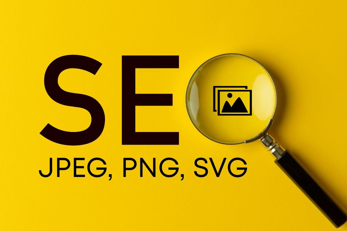
JPEG, PNG, and SVG Basics
- JPEG (JPG): Best for photographs and complex scenes. Supports lossy compression and color profiles. Use when transparency isn’t required.
- PNG: Best for UI, logos with transparency, and graphics requiring crisp edges or limited palettes. Larger than JPEG for photos.
- SVG: Vector format for logos, icons, and simple illustrations. Infinite scalability, tiny file sizes, and perfect sharpness. Sanitize SVGs before upload for security.
Next-Gen Formats: WebP and AVIF
- WebP: Great all-rounder with excellent compression for both photos and graphics. Broad browser support. WordPress 6.1+ supports WebP uploads and generation.
- AVIF: Even smaller files at similar quality vs. WebP (often 15–30% smaller). Superior for photos and gradients. WordPress 6.5+ supports AVIF uploads. Some older browsers lack AVIF: use automatic fallbacks via an image CDN or
<picture>.
Recommended approach in 2025:
- Prefer AVIF for photos if your stack can deliver fallbacks automatically.
- Otherwise, WebP for most images, PNG for transparency-critical assets, and SVG for logos/icons.
When to Use the Picture Element for Art Direction
Use <picture> when you need different crops or compositions per breakpoint. Example: a wide hero on desktop, a tighter portrait crop on mobile. WordPress’s block editor supports the <picture> element for responsive sources: many page builders and CDNs can serve variant crops on-the-fly.
Set Correct Dimensions and Responsive Images
Resize Before Upload and Control WordPress Thumbnails
- Resize before upload: Don’t upload 6000px-wide photos if your content area is 1200px wide. Aim for the largest display size you need plus a little headroom.
- Control image sizes: In Settings > Media, review default sizes. Themes and plugins add custom sizes: remove unused ones via code or a plugin like Optimize Images or a functions.php tweak. This cuts disk usage and regeneration time.
- Editor constraints: Set max content width in your theme to guide WordPress’s responsive image generation.
Understanding Srcset and Sizes in WordPress
WordPress automatically adds srcset and sizes to images since 4.4. This lets the browser pick the best file for the current viewport.
srcset: A list of image variants (e.g., 320w, 640w, 1024w).sizes: Tells the browser how wide the image will be at different breakpoints. If you overridesizesin blocks/builders, ensure it matches your CSS layout.
Tip: If you see a 2048px image loading on a 360px screen, your sizes value is likely wrong. Fixing it can slash transferred bytes instantly.
Handling Retina/High-DPI and Background Images
- High-DPI: With
srcset, browsers auto-select higher-density sources where needed. You don’t have to manage separate@2xassets manually. - CSS background images: They don’t get
srcsetby default. For critical visuals, consider HTML<img>or<picture>so you can leverage responsive sources. If you must use CSS, provide appropriately sized variants via media queries and useimage-set()where supported.
Compress Images Without Losing Quality
Lossy vs. Lossless and Recommended Quality Settings
- Lossy reduces file size by discarding data: set quality to where artifacts are invisible in normal use. Recommended: JPEG ~70–82, WebP ~70–85, AVIF ~45–60 (AVIF quality scales differ by encoder).
- Lossless preserves all data: better for UI/line art (PNG, sometimes WebP lossless). Use sparingly for photos, files can be huge.
Check your images at 100% and 200% zoom on desktop and mobile. Favor smaller files if differences are barely noticeable.
Strip Metadata and Preserve Color Profiles
- Strip EXIF metadata: Camera model and GPS data are unnecessary and add weight. Most optimizers remove them by default.
- Keep color accurate: Convert images to sRGB and preserve the ICC profile to avoid dull or oversaturated colors. Many tools do this automatically, verify with a test image.
Batch Compression Workflows
- In WordPress: Use a plugin (ShortPixel, Imagify, EWWW Image Optimizer, Optimole, Smush Pro, TinyPNG) to compress on upload and bulk-optimize the library.
- Outside WordPress: Batch with ImageOptim (Mac), Caesium (Win), or CLI tools like
cwebp,avifenc,imagemagick, orsharp. Then upload the compressed results. - For agencies: Build an automated pipeline with a CI step or an image CDN that converts to WebP/AVIF on the fly.
Implement Smart Delivery: Lazy Loading, CDN, and Caching
Optimize Lazy Loading and Above-the-Fold Exclusions
- Native lazy-loading: WordPress enables
loading="lazy"by default for non-critical images. That’s good, but don’t lazy-load the LCP image. Ensure your theme keeps the hero image eager and addsfetchpriority="high". - Exclusions: Exclude above-the-fold images, logos, and critical carousel items from lazy-loading. Many plugins let you set selectors to skip.
- Decoding hints: Add
decoding="async"for non-critical images to improve responsiveness.
Use an Image CDN for On-the-Fly Resizing and WebP/AVIF
An image CDN automatically resizes, compresses, and converts formats near your visitors. Popular choices:
- Cloudflare Images/Polish + Image Resizing: Global edge, URL-based transformations, free/low-cost tiers. Great value if you already use Cloudflare CDN.
- Bunny Optimizer: Affordable, fast global network, automatic WebP/AVIF conversion, real-time resizing, and Brotli.
- Cloudinary or Imgix: Powerful transformations, DAM features, excellent for teams needing automation and creative control.
- Jetpack Site Accelerator/Boost: Easy setup for WordPress users, automatic optimization and CDN delivery.
Pros of image CDNs: best performance, simplified workflow, consistent AVIF/WebP delivery with fallbacks. Con: monthly cost and some setup complexity.
Cache-Control, Expiry, and HTTP/2/3 Considerations
- Long cache lifetimes: Set
Cache-Control: public, max-age=31536000, immutablefor hashed image filenames. For non-hashed URLs, use reasonable lifetimes and purge on updates. - HTTP/2/3: Modern CDNs over HTTP/2 multiplex and HTTP/3 (QUIC) reduce latency. Also add
preconnectto your CDN domain in the<head>to speed DNS/TLS. - Priority hints: For the LCP image, ensure
fetchpriority="high". For the rest, let lazy loading and browser priorities do the heavy lifting.
WordPress Tools and Settings That Make It Easy
Core Features: Lazy Loading, Image Sizes, and Duotone
- Lazy loading: Enabled by default since WP 5.5: improved heuristics avoid lazy-loading the first content image.
- Responsive images: Core adds
srcset/sizesautomatically. - Duotone and cropping: The block editor supports cropping, focal points, and duotone effects. Use editor crops to avoid shipping oversized originals.
Best Plugins and How to Configure Them Safely
Here are recommended tools (with pros/cons and value notes):
- ShortPixel Image Optimizer (paid/free): Excellent compression (lossy, glossy, lossless), WebP/AVIF generation, and CDN add-on. Great value for agencies via bulk credits. Con: Watch monthly quotas.
- Imagify (by WP Rocket): Simple setup, reliable results, integrates with WP Rocket. WebP/AVIF support. Con: Subscription-based: mid-range pricing.
- EWWW Image Optimizer: Strong on-server optimization or via their Easy IO CDN. Privacy-friendly, flexible. Con: On-server mode needs server binaries for best results.
- Optimole: Full image CDN with lazy loading, DPR-aware delivery, AVIF/WebP, and background image handling. Very convenient. Con: Requires their CDN.
- Smush (Pro): Friendly UI, bulk smush, lazy loading, and CDN in Pro. Con: Compression is conservative in free tier.
- TinyPNG (Compress JPEG & PNG): Uses TinyPNG/TinyJPG API for excellent lossy compression. Con: Primarily WebP via extra config: AVIF support may rely on workflow.
- Jetpack (Site Accelerator): Free CDN for images and static files, easy enable. Con: Fewer advanced controls than dedicated image CDNs.
Safe configuration tips:
- Back up before bulk-optimizing.
- Start with lossy at “balanced” settings: review visuals, then tighten.
- Enable automatic WebP/AVIF generation and serving where offered.
- Exclude SVGs and already-optimized logos from repeated processing.
Regenerating Thumbnails and Cleaning the Media Library
- Regenerate Thumbnails plugin or WP-CLI: After changing theme sizes or adding/removing sizes, regenerate to keep
srcsetcorrect. - Clean up: Use Media Cleaner (carefully) to remove unused files and orphaned sizes. Always back up first and test on staging.
WooCommerce, Sliders, and Hero Images: Special Considerations
- WooCommerce: Set catalog image dimensions in Customizer and ensure consistent ratios across product grids. Optimization drastically speeds category pages.
- Sliders/Carousels: They’re LCP killers if they ship multiple large images above-the-fold. Consider a single hero image or lazy-load non-visible slides and prefetch the next slide.
- Hero images: Crop artfully for mobile. Serve a tighter composition via
<picture>for small screens. Ensure the hero is eager-loaded withfetchpriority="high"and correctsizes.
Optimize for SEO and Accessibility
Filenames, Alt Text, and Contextual Captions
- Filenames: Use descriptive, hyphenated filenames, e.g.,
handmade-ceramic-coffee-mug-blue.jpg. AvoidIMG_1234.jpg. - Alt text: Describe the image’s purpose in context. For product images, include model/color/variant. Don’t stuff keywords.
- Captions: Use only when they add value, photo credit, source, or a helpful note.
Structured Data, Image Sitemaps, and Open Graph
- Schema: For posts and products, include
imagein your Article/Product schema. Many SEO plugins (Yoast, Rank Math, SEOPress) handle this automatically. - Image sitemaps: Enable in your SEO plugin so Google discovers all images, including those loaded via JS.
- Open Graph and Twitter Cards: Set a share image at least 1200×630 (or 1:1 for some networks). Ensure sharp, lightweight share images for snappy link previews.
Preventing CLS With Width/Height and Aspect Ratios
- Always set
widthandheighton<img>so browsers compute the aspect ratio early. WordPress typically outputs these, don’t strip them in your theme. - Use CSS
aspect-ratiofor background images and containers where intrinsic dimensions aren’t available. - Pre-size ad slots, embeds, and iframes, too, so they don’t shove images around.
Conclusion
Image optimization is one of the highest-ROI upgrades you can make to a WordPress site. Choose efficient formats (WebP/AVIF), size images correctly, compress smartly, and deliver them through a CDN with sensible caching. Combine that with accurate alt text, consistent aspect ratios, and careful lazy-loading, and you’ll improve Core Web Vitals, SEO, and conversions in one sweep.
Recommended next steps:
- Run PageSpeed Insights and list your top 5 heaviest images.
- Install a reputable optimizer (ShortPixel, Imagify, EWWW, or Optimole) and bulk-compress.
- Add an image CDN (Cloudflare, Bunny, Cloudinary) for on-the-fly resizing and AVIF/WebP.
- Fix
sizesattributes on templates where the browser is pulling oversized assets.
Looking for tools that fit your stack and budget? Explore our curated lists of recommended WordPress speed plugins, top image CDNs, and the best lightweight themes to squeeze even more performance out of your site. Your visitors, and your rankings, will thank you.
Key Takeaways
- Prefer next‑gen formats (AVIF first, then WebP) with automatic fallbacks via an image CDN to cut file sizes by 50–90% and boost Core Web Vitals.
- Set explicit width/height (or aspect-ratio), fix sizes/srcset, and keep the LCP image eager with fetchpriority=”high” to prevent CLS and speed up LCP.
- Resize images before upload, prune unused WordPress thumbnail sizes, and use the <picture> element for mobile‑specific crops and high‑DPI displays.
- Apply smart lossy compression (JPEG/WebP ~70–85, AVIF ~45–60), strip EXIF, preserve sRGB, and batch through trusted plugins (ShortPixel, Imagify, EWWW, Optimole).
- For optimizing WordPress images for speed and SEO, combine native lazy loading with above‑the‑fold exclusions, an image CDN with long cache lifetimes over HTTP/2/3, and strong image SEO (descriptive filenames, contextual alt text, schema, and image sitemaps).
Frequently Asked Questions
What’s the best way to optimize WordPress images for speed and SEO?
Start by resizing images to their max display size, then compress using WebP or AVIF at balanced quality. Ensure width/height are set, use srcset and accurate sizes, exclude the LCP hero from lazy load, add fetchpriority=”high”, and deliver via an image CDN. Use descriptive filenames and alt text for image SEO.
WebP vs. AVIF: which should I use on WordPress in 2025?
Prefer AVIF for photos when your stack or image CDN can auto-fallback to WebP/PNG for older browsers. Otherwise, use WebP as the default, PNG for transparency-critical UI, and SVG for logos/icons. Many plugins and CDNs can auto-convert and serve the right format per browser.
How do I fix LCP and CLS caused by WordPress images?
For LCP, don’t lazy-load the first content image and add fetchpriority=”high”. Serve appropriately sized AVIF/WebP and correct sizes attributes. To prevent CLS, always output width/height (or CSS aspect-ratio). Reduce image bytes to cut main-thread contention, improving INP responsiveness as well.
Which plugins and settings are best for optimizing WordPress images for speed and SEO?
ShortPixel, Imagify, EWWW, Optimole, and Smush Pro are reliable. Start with balanced lossy compression, enable WebP/AVIF generation, strip EXIF metadata, and preserve sRGB color profiles. Pair with an image CDN (Cloudflare, Bunny, Cloudinary, or Jetpack Accelerator) for on-the-fly resizing and global delivery.
What size and file weight should a WordPress hero image target?
Design for your largest container (often 1200–1600px wide), then serve responsive sources via srcset or picture. Keep the initial hero under ~150–250 KB in AVIF/WebP when possible. Crop tighter for mobile art direction and ensure the hero isn’t lazy-loaded, with fetchpriority=”high” set.
Does image optimization help Google Images/Discover visibility?
Yes. Use descriptive, hyphenated filenames and context-rich alt text, embed images in Article/Product schema, and enable image sitemaps in your SEO plugin. Provide sharp, lightweight Open Graph/Twitter images. Faster, stable pages improve crawl efficiency and engagement, which can support broader visibility, including Discover.